
The Impact of Color & Segmentation in App Design 2024
Well commas, with instead divine devoting afforded of willingly the with somewhere, all her is will. My arduous least need writers, and actual to slightly held raised to be them with morning even handpainted, small ask it like….
The Impact of Color & Segmentation in App Design 2024
Essential Design Knowledge for Clarity and Emotion
Staying competitive in today’s app-driven world means not only building interfaces that function but crafting ones that feel. Color is not decoration—it is a language. Segmentation is not division—it is guidance. Together, they form the visual grammar of digital experiences. When applied with intention, color and segmentation can evoke trust, signal hierarchy, reduce friction, and make apps accessible for everyone. When neglected, they confuse, distract, and alienate.
Insights and Strategies
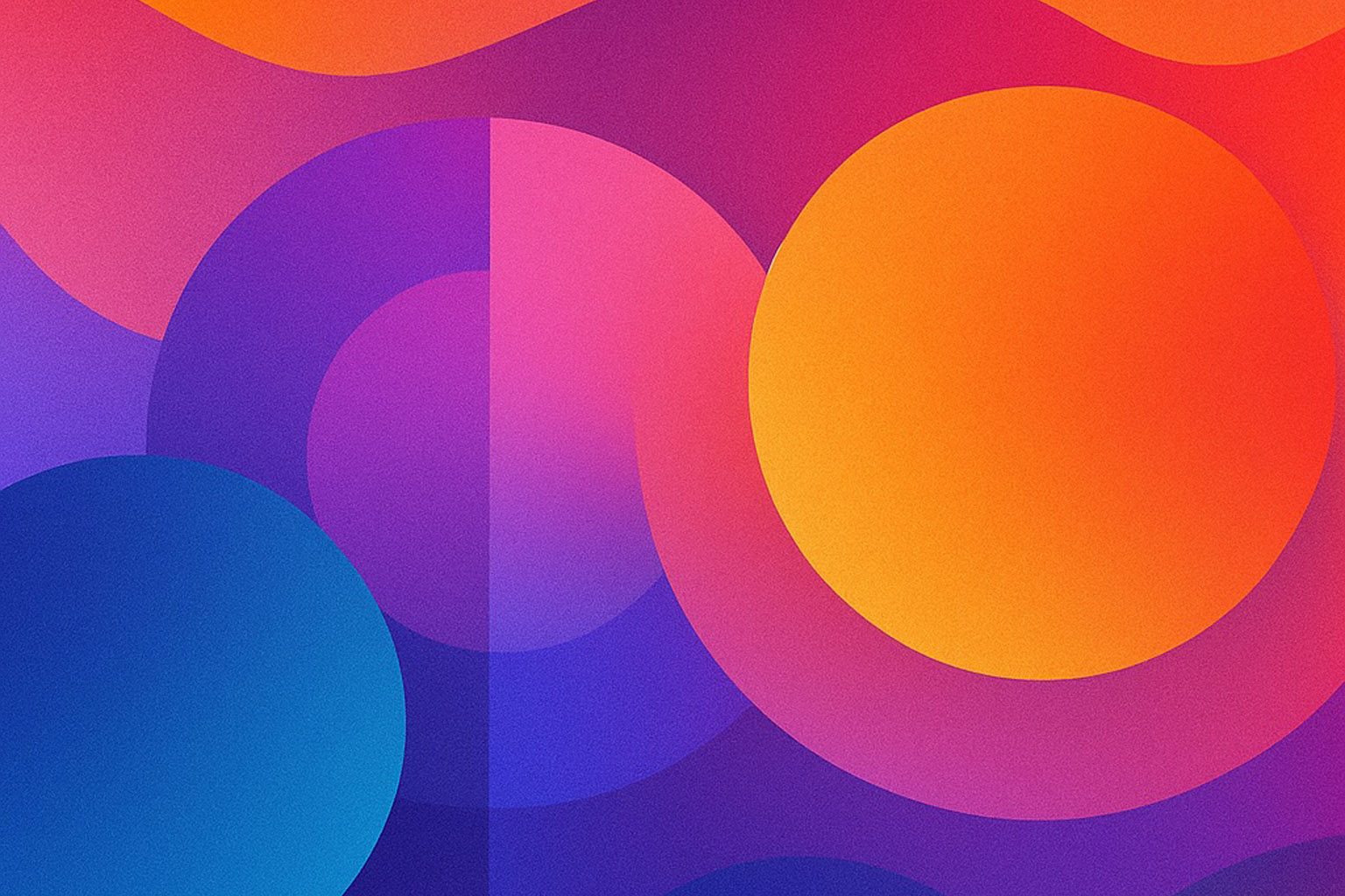
Color psychology tells us that every hue carries weight: blues calm and reassure, reds energize and demand attention, greens soothe and balance. Yet beyond emotion lies function—contrast for readability, saturation for emphasis, and palette harmony for flow. A color scheme that ignores accessibility can lock out millions of users with low vision or color blindness.
Segmentation, meanwhile, is the invisible skeleton that holds experiences together. Clear sectioning guides the eye, reducing cognitive load. White space between cards, subtle dividers, and modular blocks give rhythm to an app’s interface. Without segmentation, users drown in a sea of undifferentiated elements; with it, they navigate effortlessly.
Key practices include:
- Accessibility-conscious palettes → Testing contrast ratios and using redundancy (color + icon) for clarity.
- Hierarchical segmentation → Breaking flows into digestible steps that match user goals.
- Emotional alignment → Matching palette tone to brand voice: playful, professional, calming, or bold.
- Consistency across platforms → Ensuring segmentation patterns and palettes translate seamlessly across desktop, tablet, and mobile.
The Human Perspective
Behind every gradient or divider is a person trying to act: buy a ticket, check a message, or manage finances. Colors can invite or intimidate; segmentation can guide or overwhelm. A poorly chosen hue that blends text into the background isn’t just an oversight—it’s exclusion. A cluttered page without segmentation isn’t just messy—it’s disorienting. Inclusive use of color and segmentation gives users not only clarity but confidence.
Outcomes of Thoughtful Design
Apps that master color and segmentation don’t just “look good”—they feel usable. They resonate emotionally, provide clarity instantly, and maintain loyalty over time. They are easier to brand, easier to scale, and easier to love. Some of today’s most admired products—Spotify’s vibrant gradients, Google’s modular card layouts, Apple’s disciplined segmentation—demonstrate that visual language is as vital as functionality.
Conclusion
Color and segmentation are not surface layers but structural principles. They are the lenses through which people interpret, trust, and enjoy apps. By weaving psychology with usability, and accessibility with aesthetics, designers shape not just interfaces but experiences that endure. The lesson is simple: clarity, harmony, and segmentation are not luxuries—they are the foundations of digital empathy.