
The Principles of Typography in Design Systems & Branding
Typography as a bridge between function and creativity.
Essential Knowledge for Visual Identity
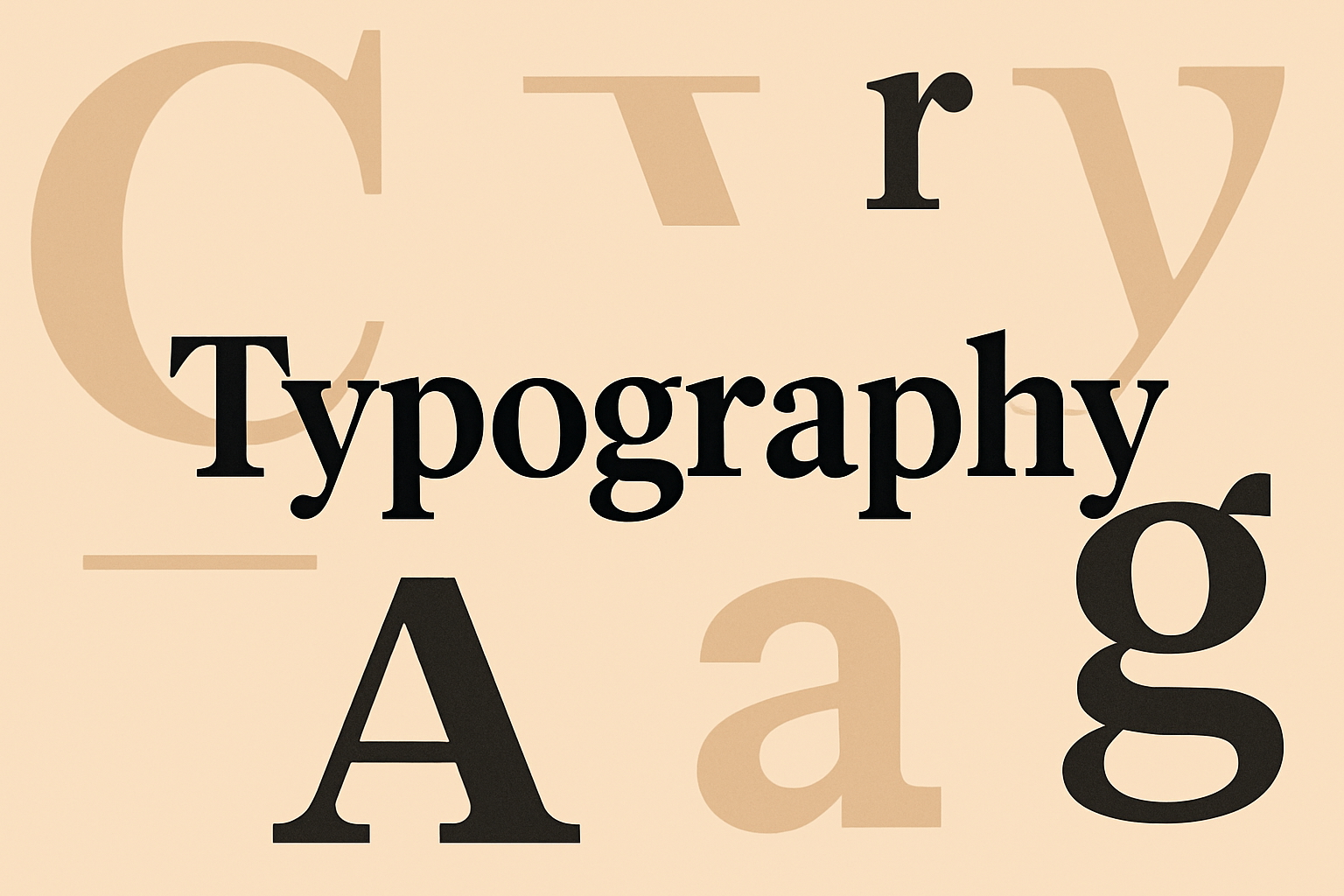
Typography is more than choosing fonts—it’s the voice, rhythm, and personality of design. In digital and physical spaces alike, type sets the tone: bold headlines demand attention, subtle serifs whisper elegance, and consistent hierarchies guide the eye. In 2024, brands and design systems that understand the weight of typography build stronger connections because type communicates silently but powerfully across every medium. For businesses, marketers, and designers, mastering typography is both craft and strategy—it shapes trust, recognition, and identity.
Insights and Strategies
Typography mistakes often stem from neglecting fundamentals: poor contrast, inconsistent line heights, or overstuffed layouts that suffocate meaning. Fonts may be misaligned with brand values, creating dissonance rather than harmony. Effective design systems and branding embrace type as the backbone of clarity and cohesion.
- Consistency across platforms → A unified type system ensures seamless transitions between print, mobile, and web.
- Hierarchy and segmentation → Clear font sizing, weights, and spacing establish a natural flow for the reader’s eye.
- Legibility for all audiences → From accessible font choices to proper contrast, type supports inclusivity.
- Brand voice in typeface → Serif for tradition, sans-serif for modernity, display fonts for emphasis—each choice is a narrative tool.
Typography is not decoration; it’s an architecture of meaning. When aligned with brand identity, it becomes an unspoken promise of quality and intention.
The Human Perspective
Typography, at its core, reflects human expression. The way letters curve, align, or space apart mirrors emotion and intent. A handwritten-inspired font can feel intimate; a rigid geometric typeface conveys precision and authority. When design systems respect these nuances, type doesn’t just support content—it embodies the message. For users, typography dictates comfort: whether they linger on an article, trust a product, or resonate with a brand’s authenticity.
Outcomes of Typographic Design
Strong typographic principles elevate design systems from functional to memorable. Brands with recognizable typefaces—think Apple’s sleek sans-serif or The New York Times’ iconic gothic—achieve timelessness. Accessible, well-structured typography expands audience reach while enhancing overall usability. Beyond brand recall, effective type choices fuel creativity, inspiring new ways to segment information and engage users.
Conclusion
Typography in 2024 stands as a pillar of design—an equal partner to color, imagery, and layout. It is the invisible hand guiding users, the subtle rhythm defining tone, and the enduring mark of brand identity. By embedding thoughtful typography into design systems and branding, we create more than beautiful visuals—we create experiences that speak, persuade, and endure.