Hiraku
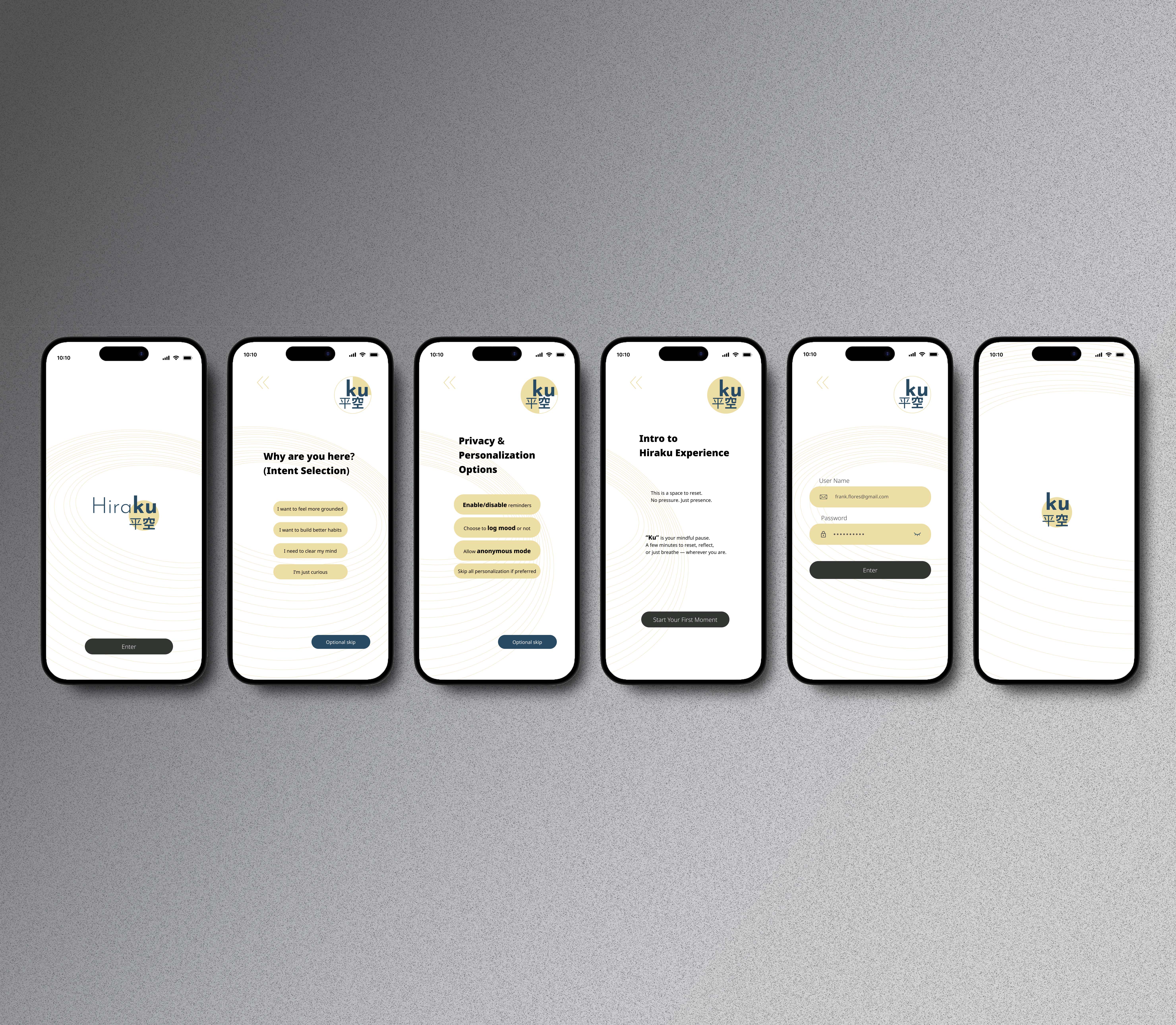
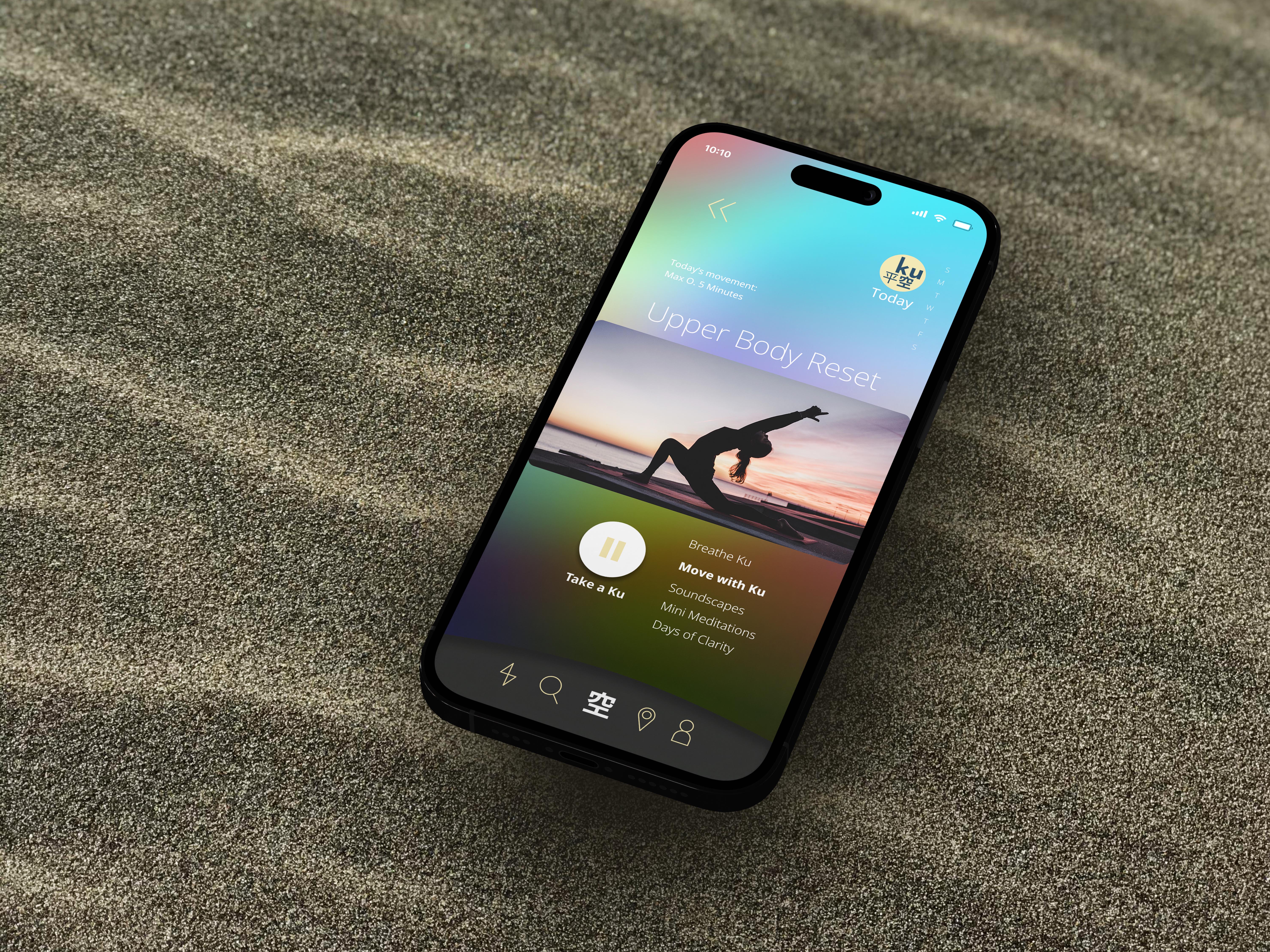
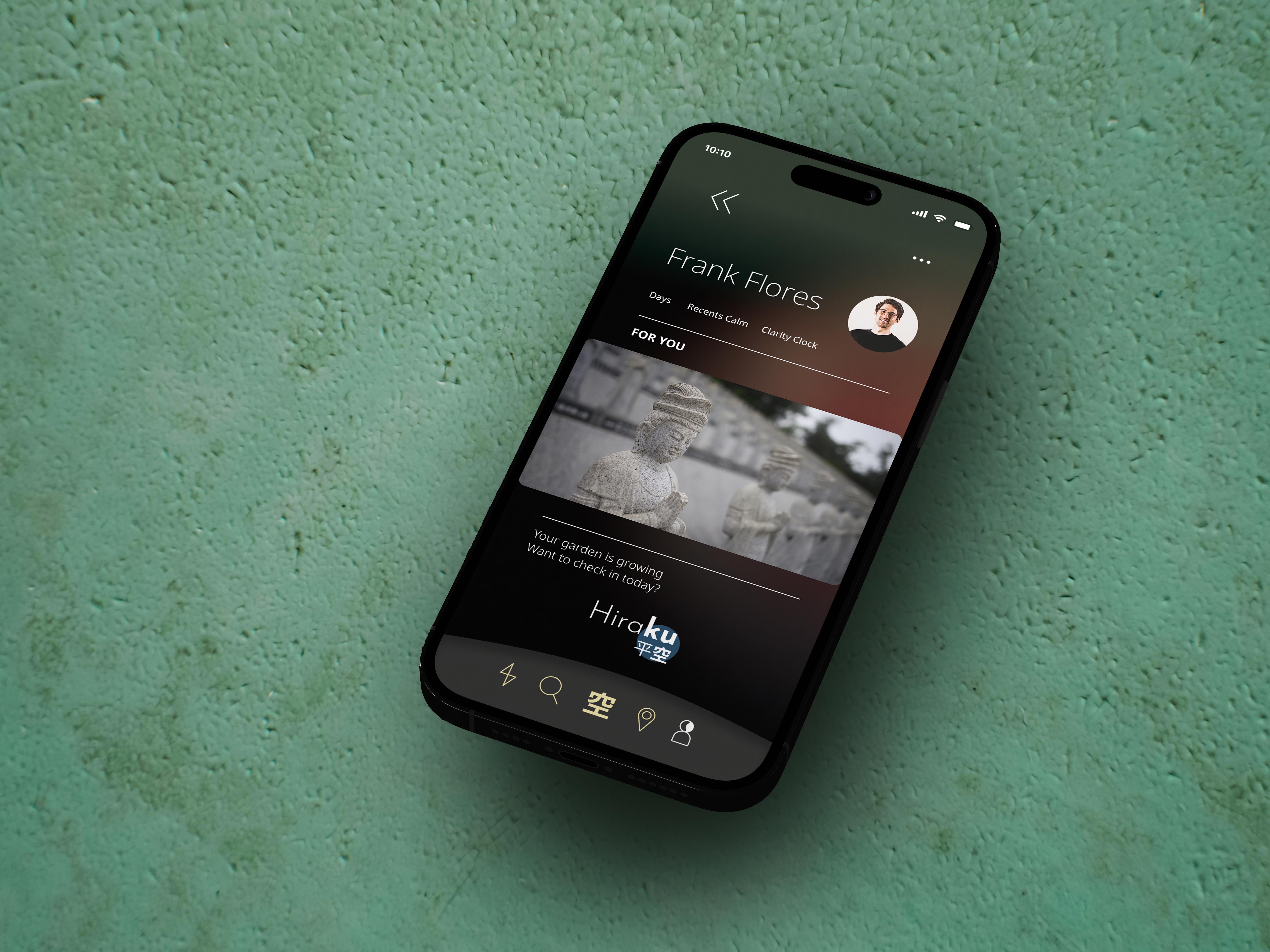
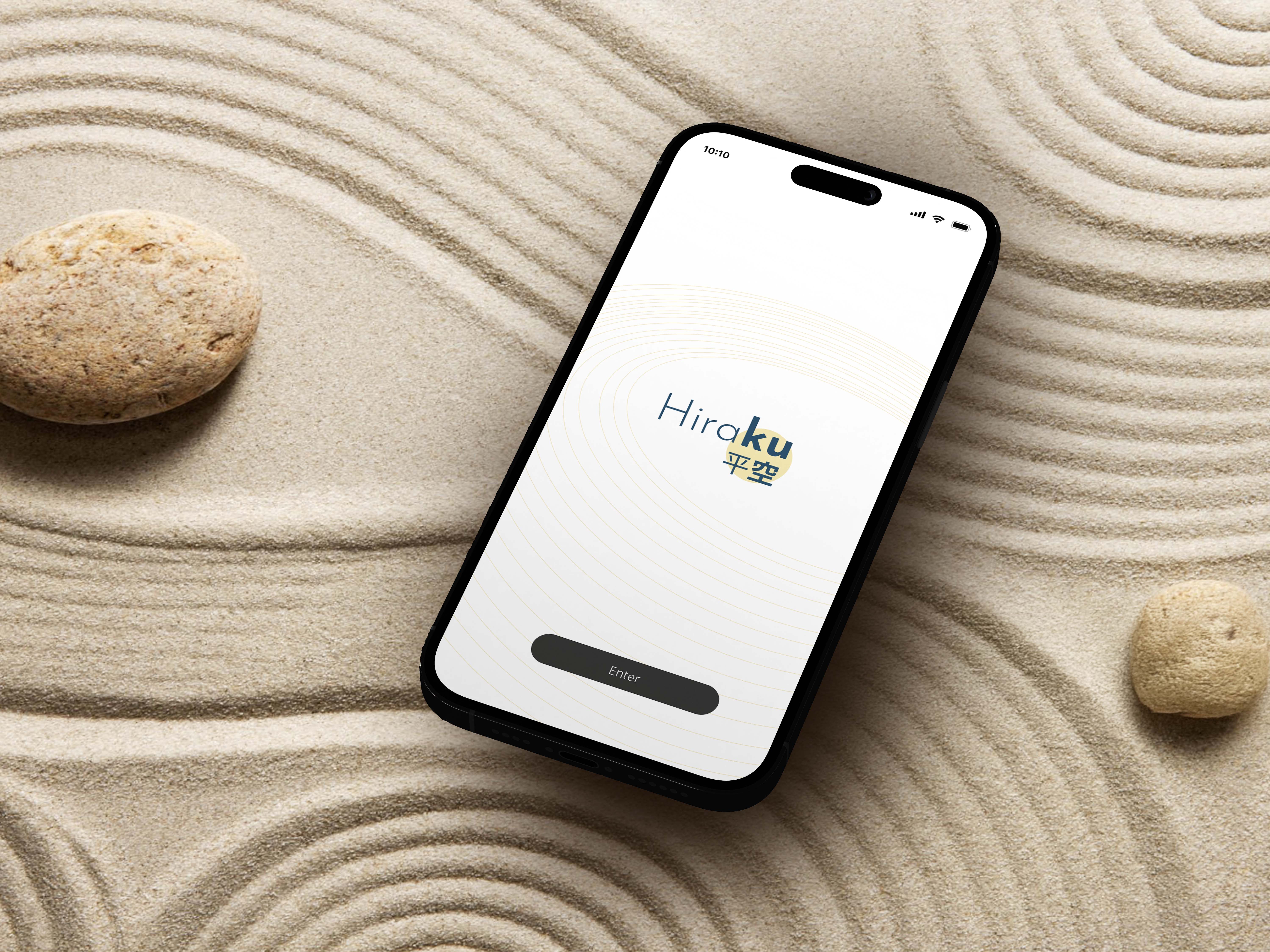
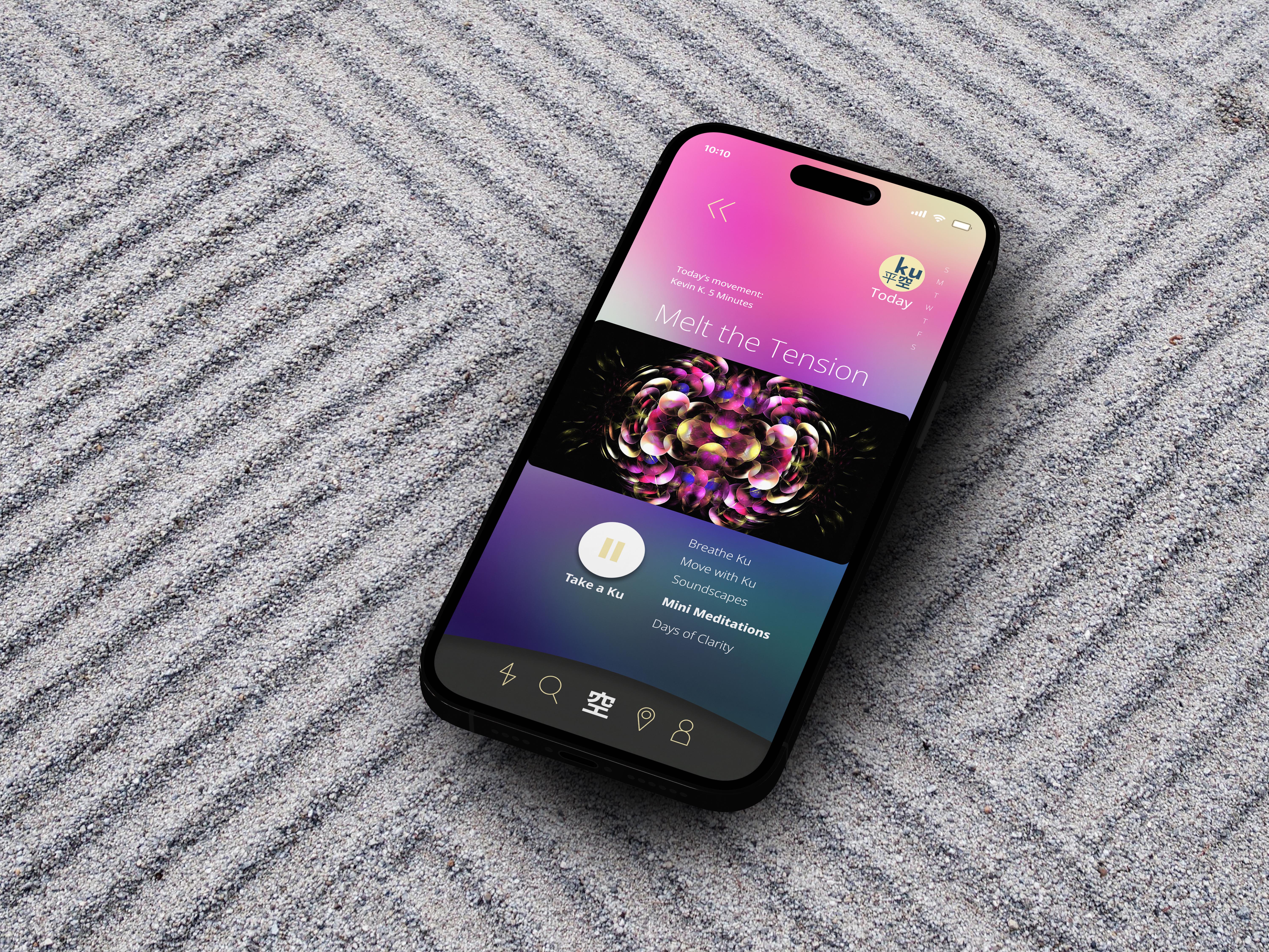
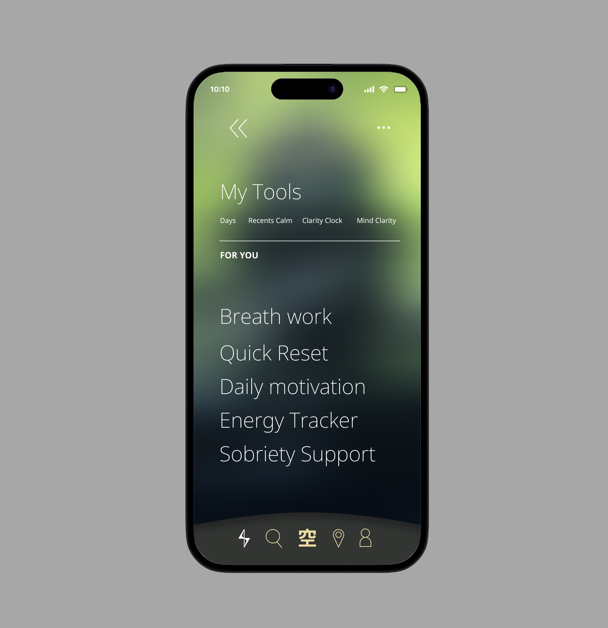
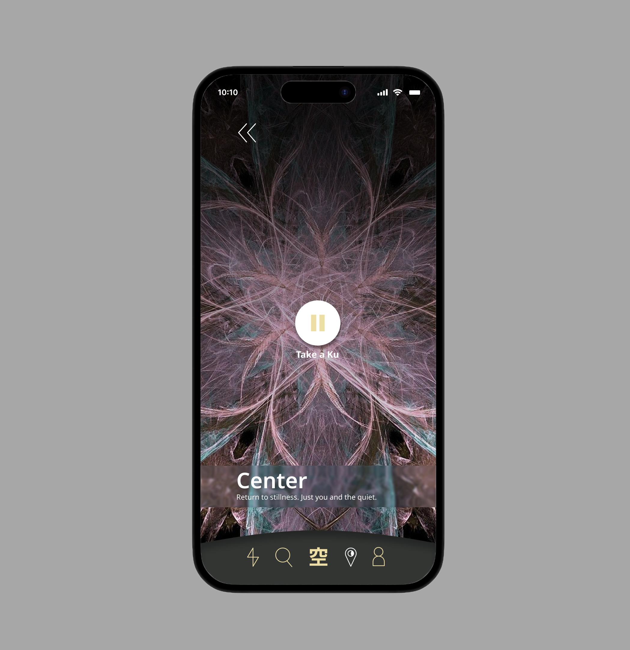
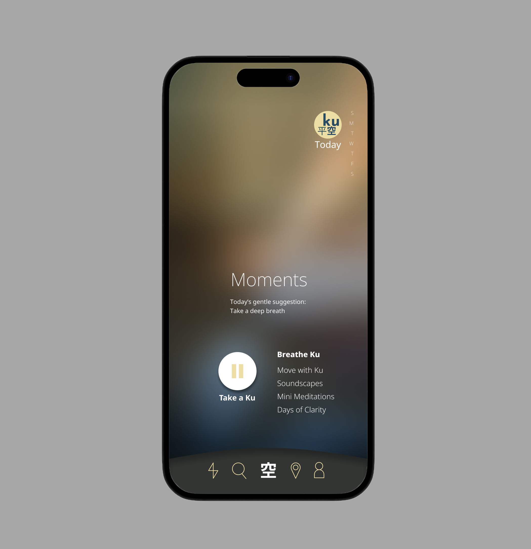
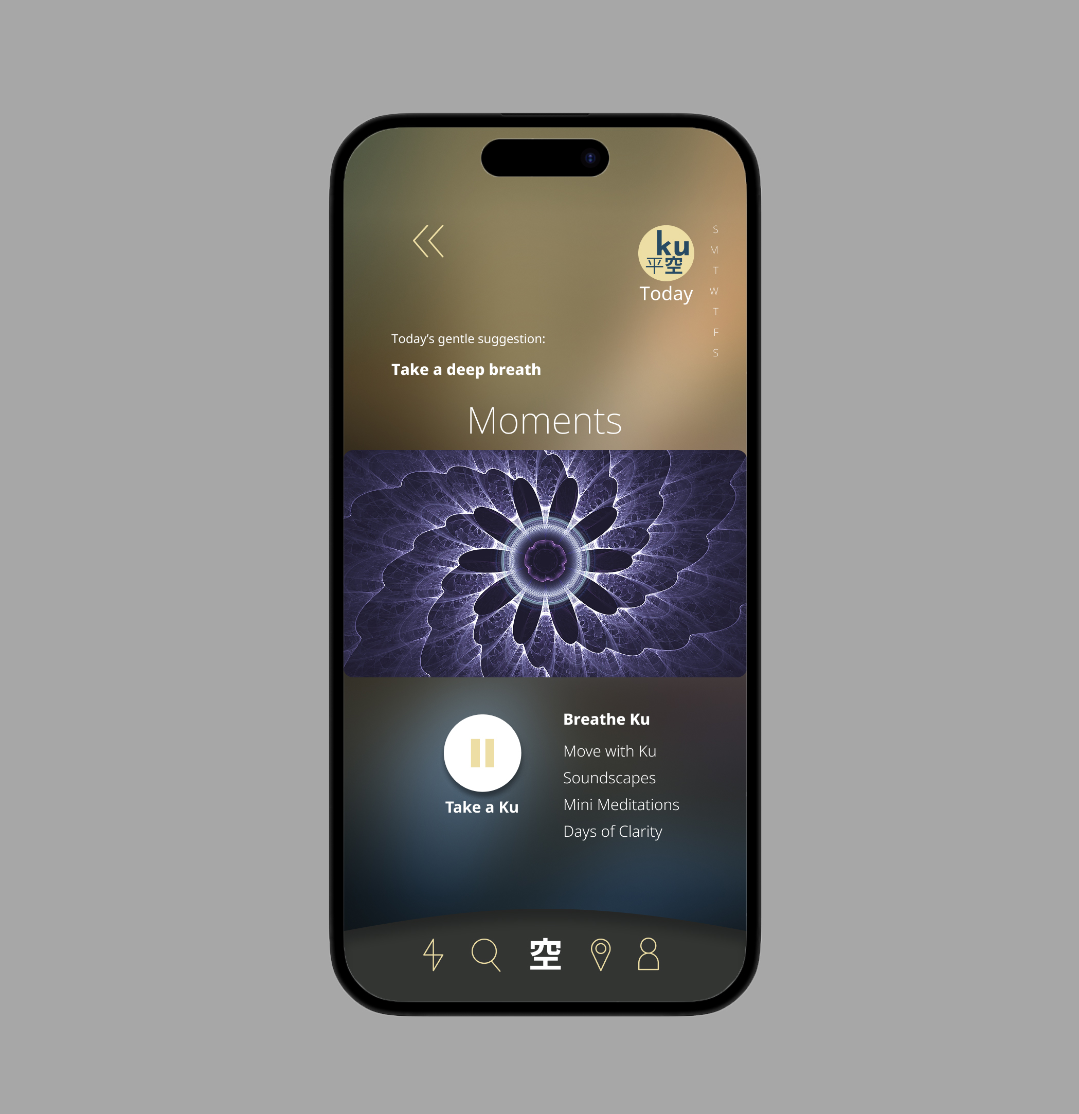
Hiraku is designed for people navigating stress, burnout, or habits they want to change, without the weight of stigma. With gentle mood check-ins, habit tracking, and supportive spaces, it encourages small steps toward balance, making wellness approachable, affordable, and human.
Project Name
Hiraku application
Headquarters
Atlanta, US
Industry
Software development
Company Size
51 — 200 employees
Timeline
Summer, 2025
Project Overview
Role: Sole UX/UI & Product Designer · Concept case study, Summer 2025. The result: a stigma-free wellness experience built around gentle, judgment-free check-ins and non-linear progress — proof that a wellness product can support people without labeling them.
Hiraku is a concept mental-wellness app built on a simple premise: support shouldn’t require a label. Designed for people navigating stress, burnout, or habits they’d like to change, Hiraku replaces the clinical, gamified tone of most wellness apps with something gentler — an experience built to meet people where they are, not where an app thinks they should be.
The Problem
Research into the wellness-app category, including simulated user interviews and affinity mapping, surfaced five recurring gaps:
- Stigma baked into the language – Clinical or heavy-handed copy discourages exactly the users who’d benefit most from engaging.
- Tracking that adds pressure instead of removing it – Rigid progress charts and gamified streaks punish anyone whose week doesn’t go as planned.
- Cost as a barrier – Subscription pricing puts consistent support out of reach for everyday users.
- Narrow definitions of wellness – Few apps make room for users who don’t identify with traditional “mental health” framing.
- Cluttered, overwhelming interfaces – Interfaces packed with metrics and prompts work against the calm they claim to offer.
Goals
- Build a stigma-free experience that feels subtle rather than clinical.
- Make reflection approachable through gentle, low-pressure check-ins.
- Design for non-linear progress — users can pause and return without penalty or guilt.
- Keep the product affordable and accessible by design, not as an afterthought.
- Ground the whole experience in a calm, consistent design system built around inclusivity.
Process & Approach
1. Research
- Audited Calm, Headspace, and leading journaling apps against the goals above.
- Simulated user interviews and affinity diagramming pointed to the same three needs: subtlety, inclusivity, and affordable pricing.

2. Information Architecture
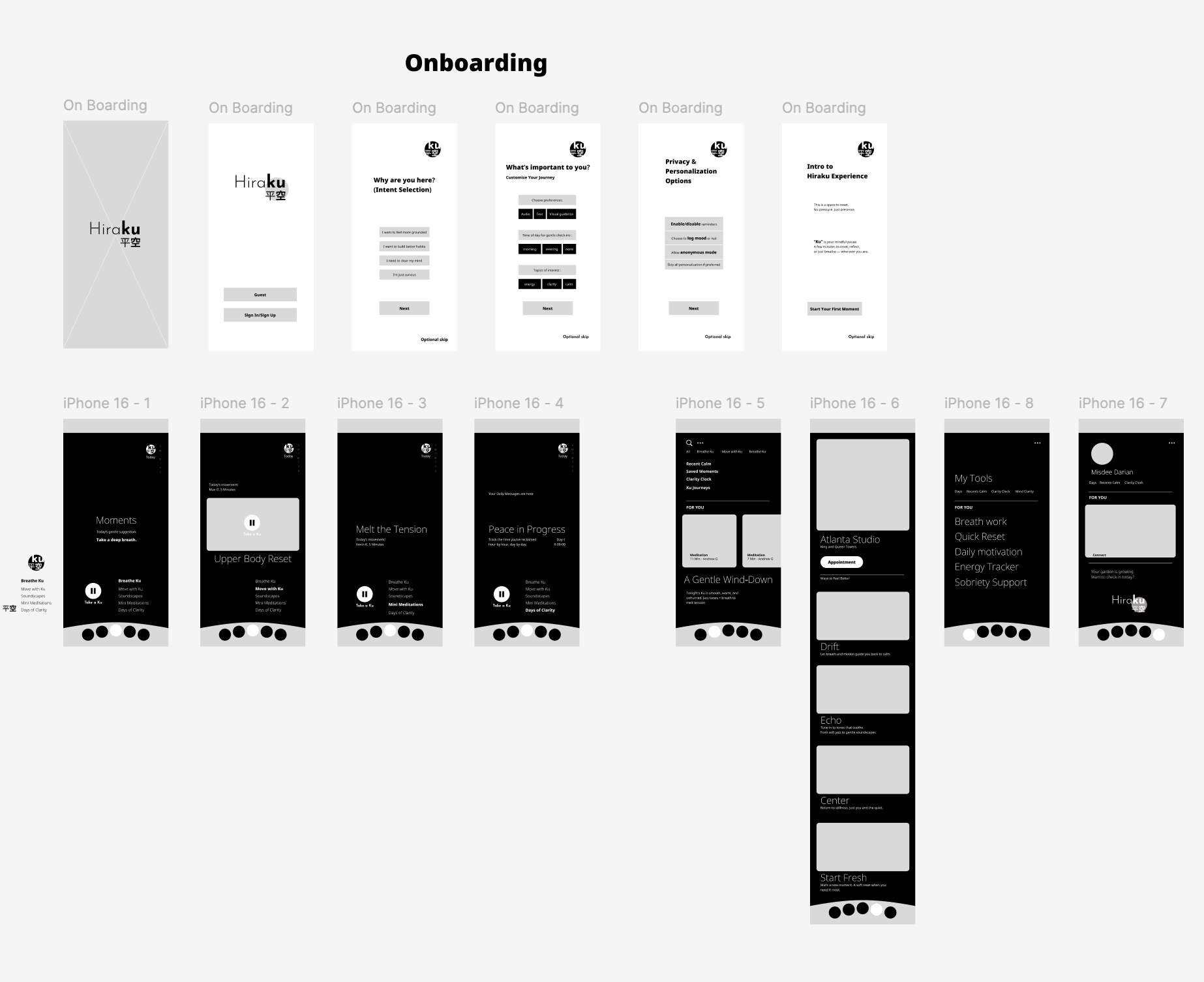
- Structured the product around three flows: Mood Check-In → Habit Reflection → Community/Support.
- Cut friction by minimizing steps and visual clutter at every stage.
3. Wireframes
- Tested low-fidelity flows across different tones of voice and interaction styles.
- Iterated until usability and a calm, non-intrusive feel could coexist.
4. Design System
- Built around soft colors, rounded typography, and fluid spacing intended to lower stress on sight.
- Created reusable UI components to keep the system scalable and consistent.
5. Prototyping & Testing
- Usability testing weighed emotional tone as heavily as function — how a screen felt mattered as much as how it worked.
- Rewrote copy across the product until it read as supportive rather than prescriptive.
Where AI Fit In
AI tools supported specific steps rather than replacing them: synthesizing research findings, generating early wireframe variations, running accessibility pre-checks (contrast, labeling, structure) ahead of manual review, drafting UX copy variations for revision, generating supporting visuals, and pressure-testing prototype flows before usability testing. Every output was reviewed, edited, and validated by hand.
Solutions Delivered
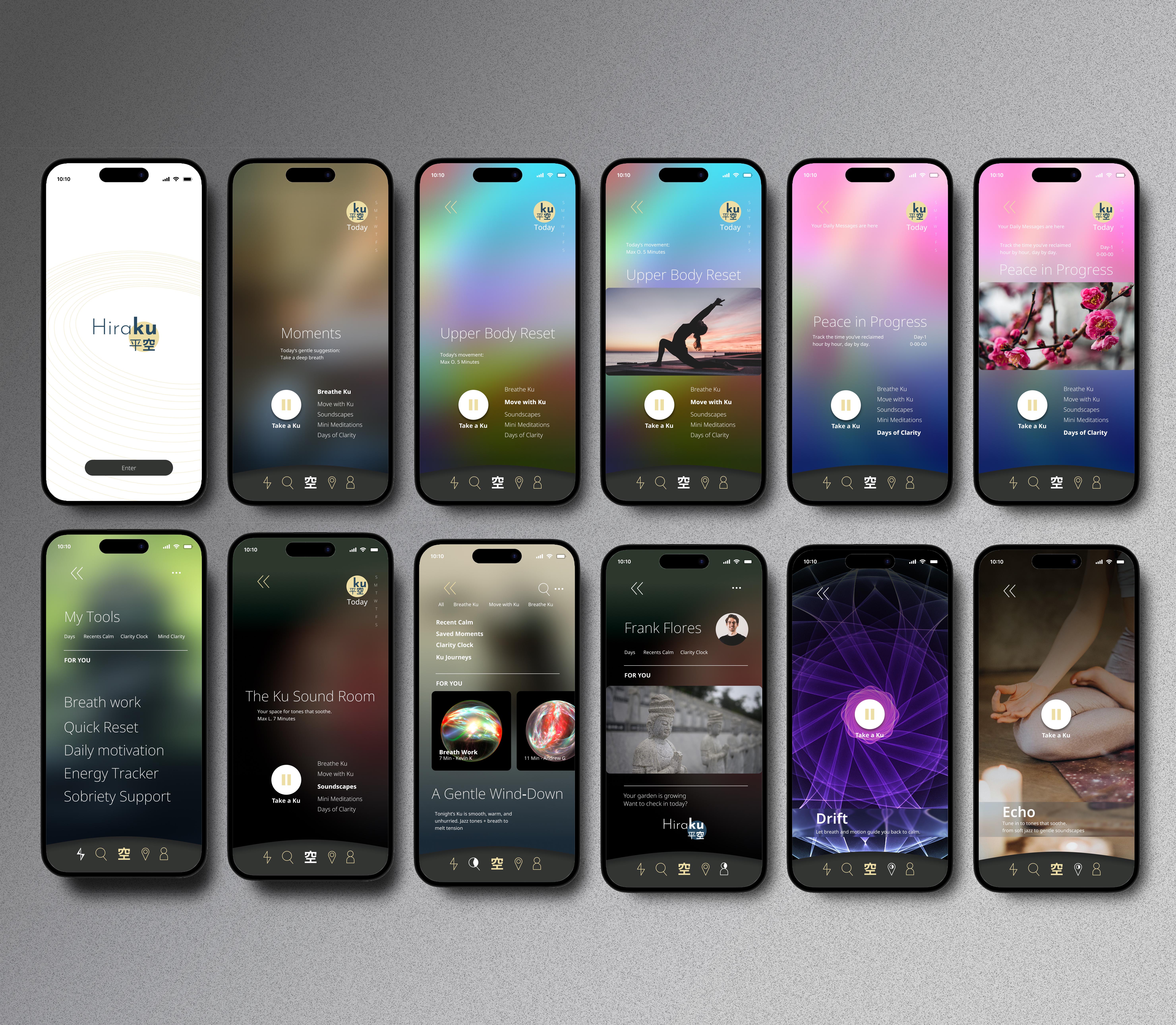
- Gentle mood check-ins → Space to reflect without pressure, streaks, or judgment.
- Habit reflection over habit tracking → Encourages small, achievable steps instead of rigid metrics.
- An accessible pricing model → Designed from the outset to reach users priced out of competitors.
- Inclusive, stigma-free language → Copy built on emotional intelligence rather than clinical framing.
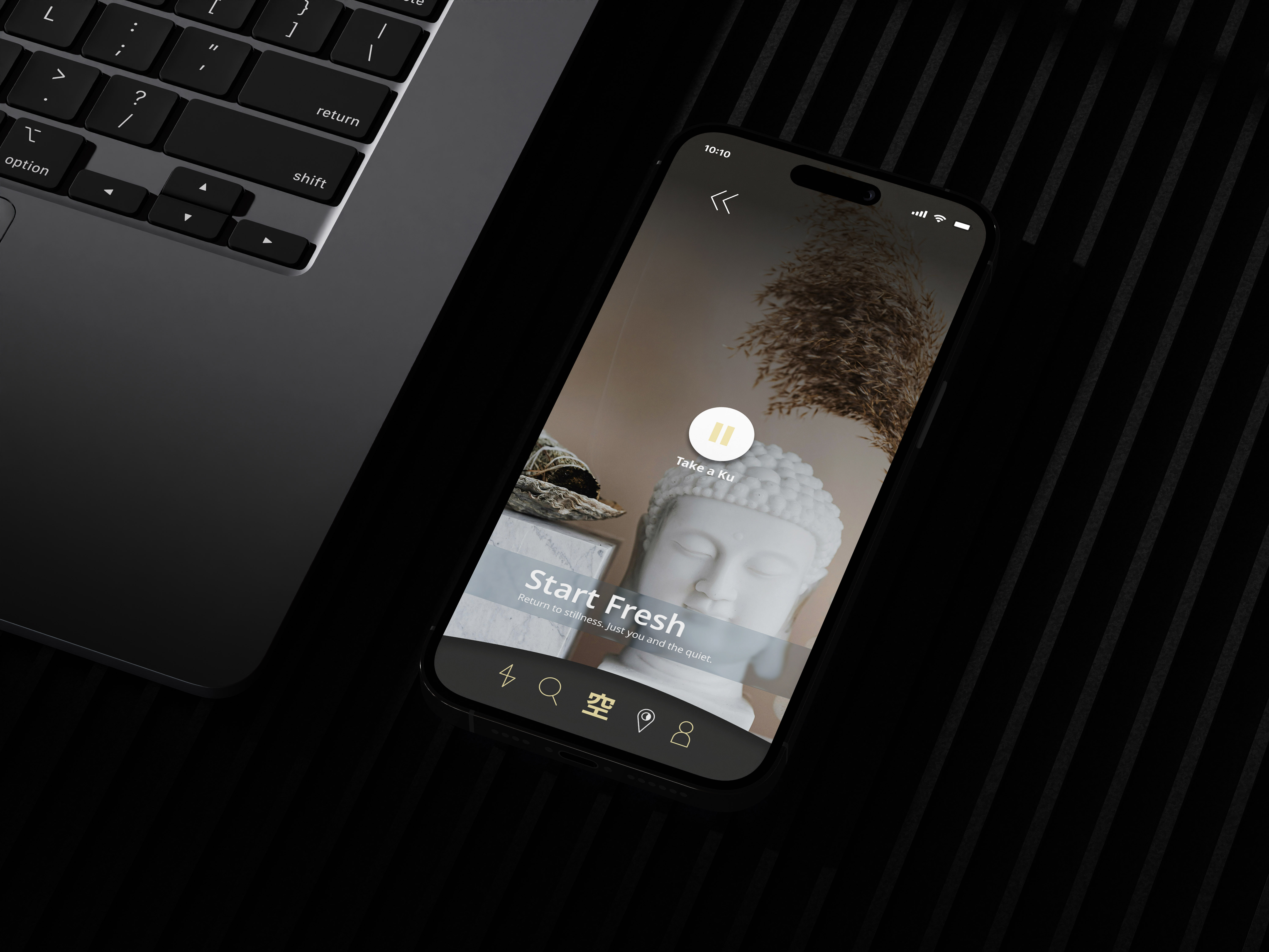
- A calming, cohesive design system → Consistent color, typography, and components that make the product feel like a safe space, not a task list.
Outcome
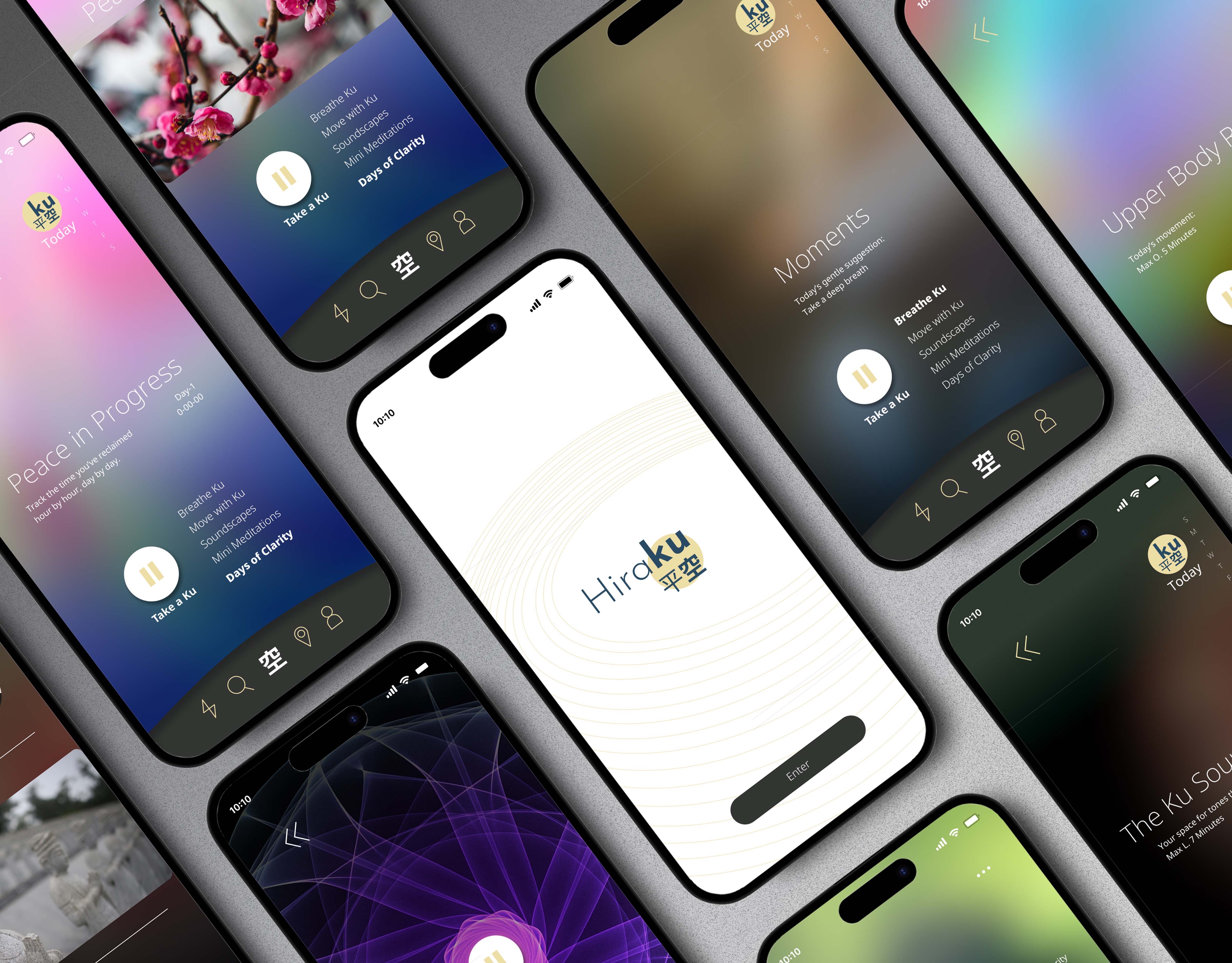
Hiraku reframes what a wellness app can be when subtlety, inclusivity, and user autonomy come first. By designing directly against the stigma, cost, and usability gaps in the category, the concept offers a credible path for people to reflect, adjust, and find balance on their own terms — without ever being made to feel like a project to fix. As a concept project, the natural next step is longitudinal testing with real users to see whether non-linear progress actually holds up as a habit over months, not just a session.