Peach Jet
Peach Jet reimagines the flight booking experience by removing clutter and hidden costs. With a simplified flow, visual seat maps, and upfront transparency, it turns a stressful process into a smooth and trustworthy journey.
Project Name
Peach Jet Application
Headquarters
Atlanta, US
Industry
Airline
Company Size
51 — 200 employees
Timeline
Summer, 2025
Project Overview
Peach Jet is a flight booking app concept created to simplify air travel. The challenge was to design a booking flow that feels fast, intuitive, and transparent — avoiding the clutter and confusion common in existing airline apps.
The Problem / Gaps Identified
- Complex booking flows – Existing airline apps overwhelm users with too many steps, unclear navigation, and hidden fees.
- Lack of price transparency – Users often feel tricked by sudden add-ons at checkout.
- Difficult seat selection – Many apps bury seat maps or make the process confusing.
- Inconsistent design language – Disjointed UI elements lead to poor user trust.
- Accessibility gaps – Lack of proper hierarchy, contrast, and assistive design for different users.
Goals
- Create a clear, fast booking experience from search to checkout.
- Ensure transparent pricing with no hidden surprises.
- Make seat selection easy and visual.
- Build a cohesive design system for scalability.
- Improve accessibility and inclusivity across the app.
Process & Work Steps
1.
Research
- Competitive analysis of Delta, United, Southwest, Turkish Airlines apps.
- User feedback highlighted frustration with checkout and seat selection.
2.
Information Architecture
- Streamlined the booking flow into fewer, logical steps.
- Prioritized key actions: Search → Select Flight → Seat → Checkout.
3.
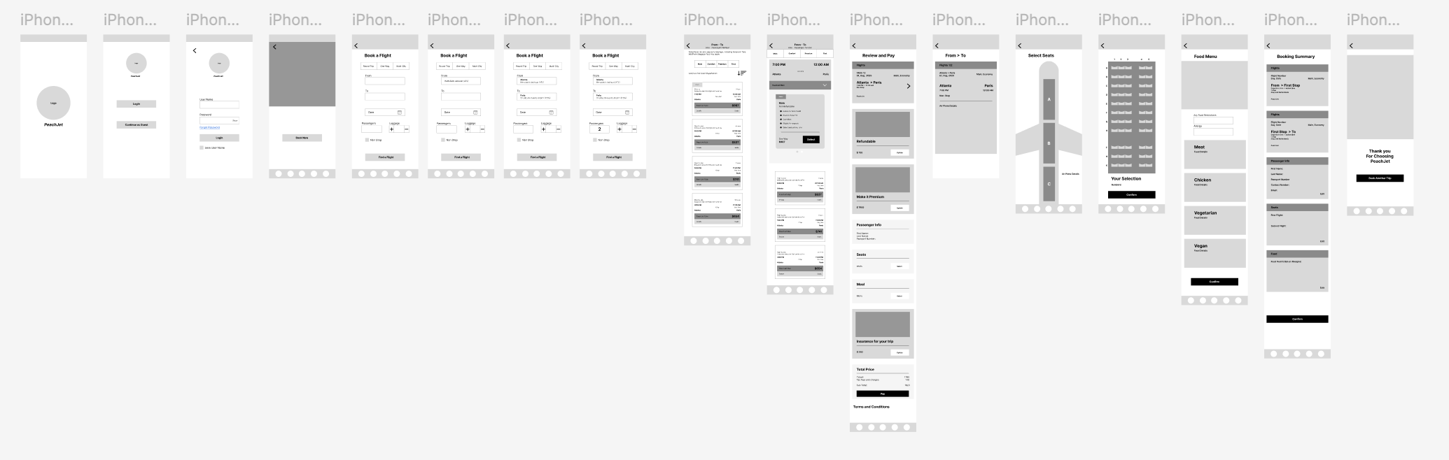
Wireframes
- Low-fidelity sketches to map user journeys.
- Iterated to reduce clicks and distractions.
4.
Design System
- Created a visual language with color, typography, and icons aligned to Peach Jet’s identity.
- Built reusable components for consistency.
5.
Prototyping & Testing
- Interactive prototypes tested with users.
- Iterations focused on reducing booking time and clarifying price transparency.
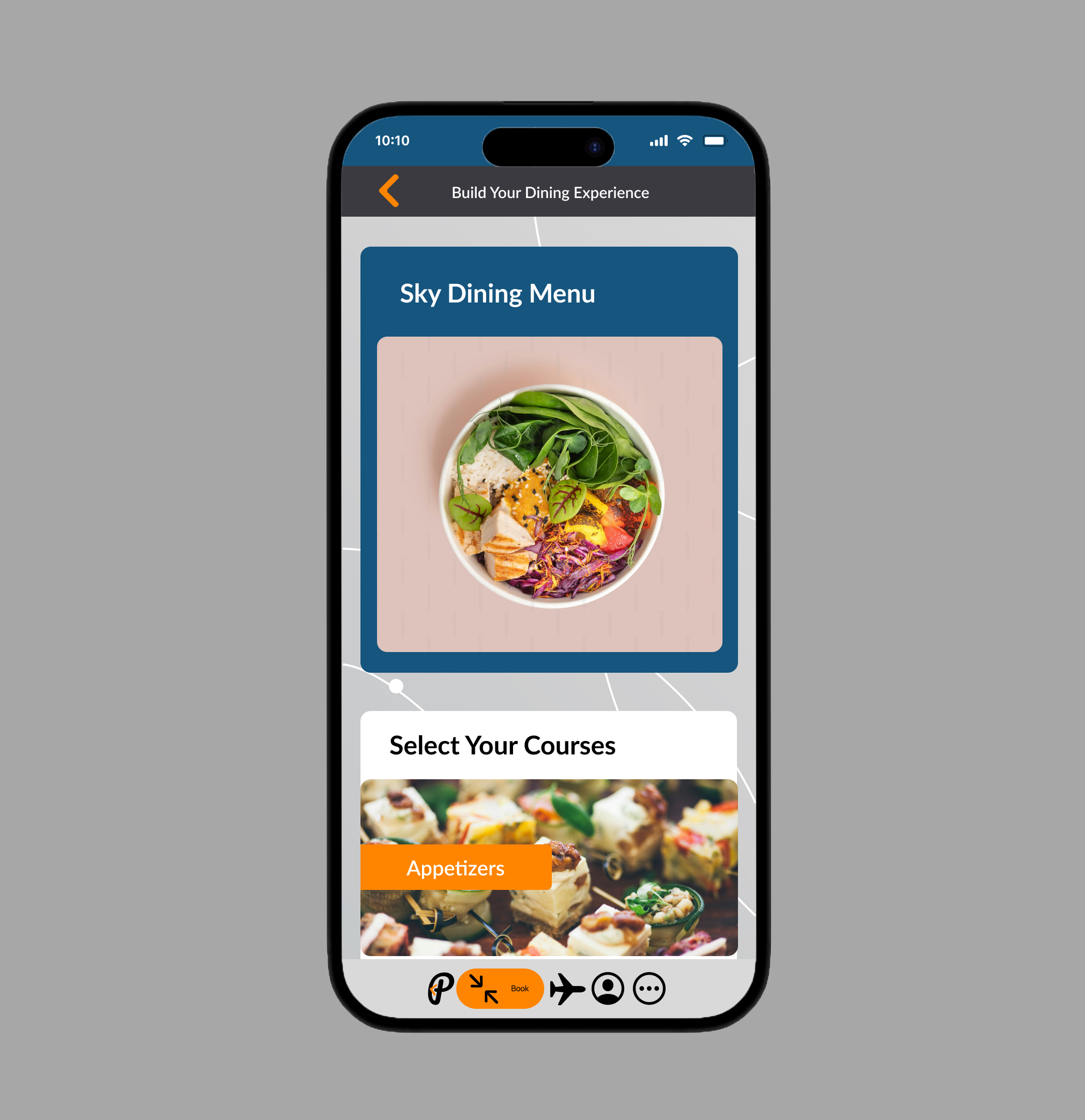
Solutions Delivered
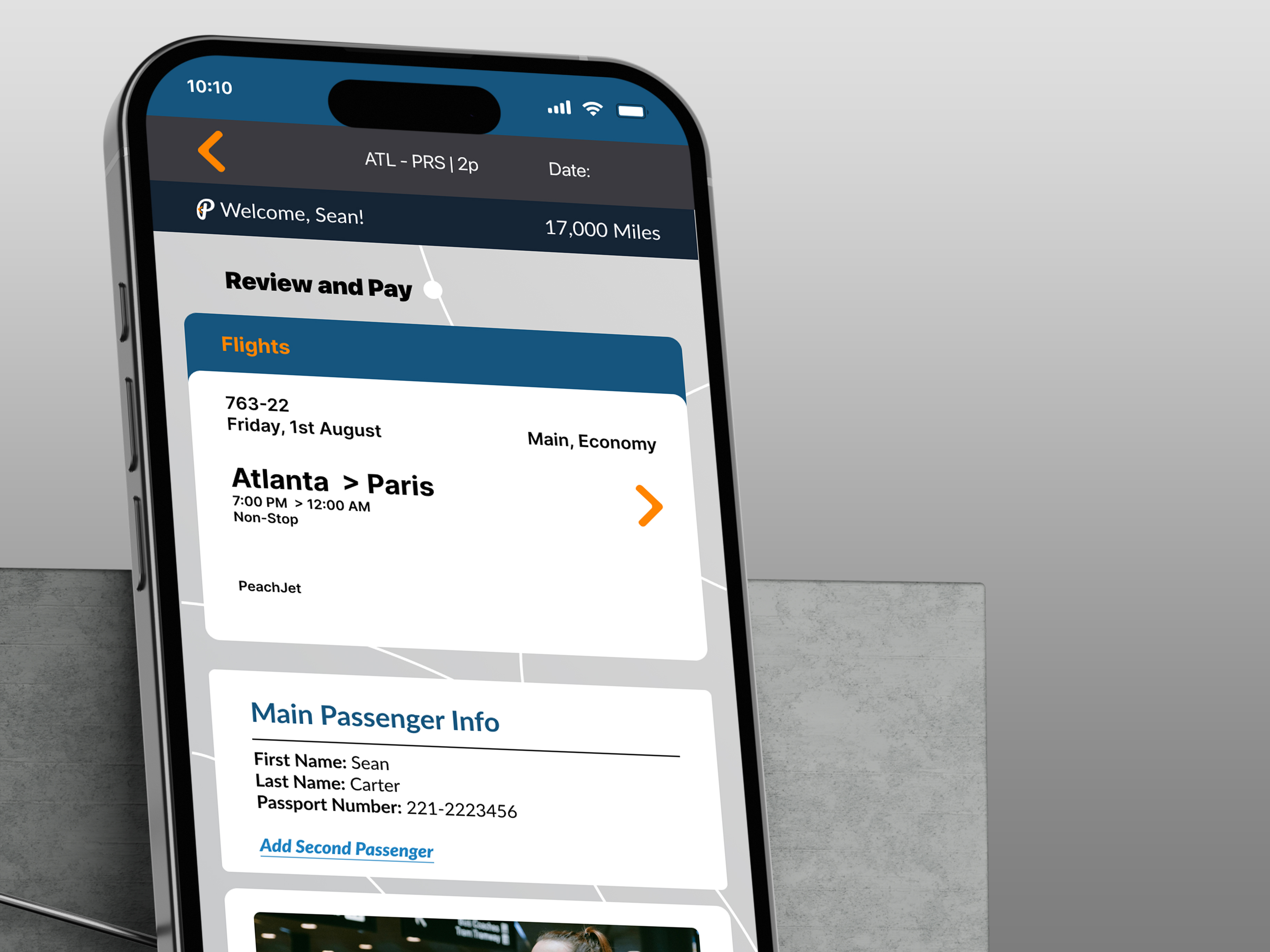
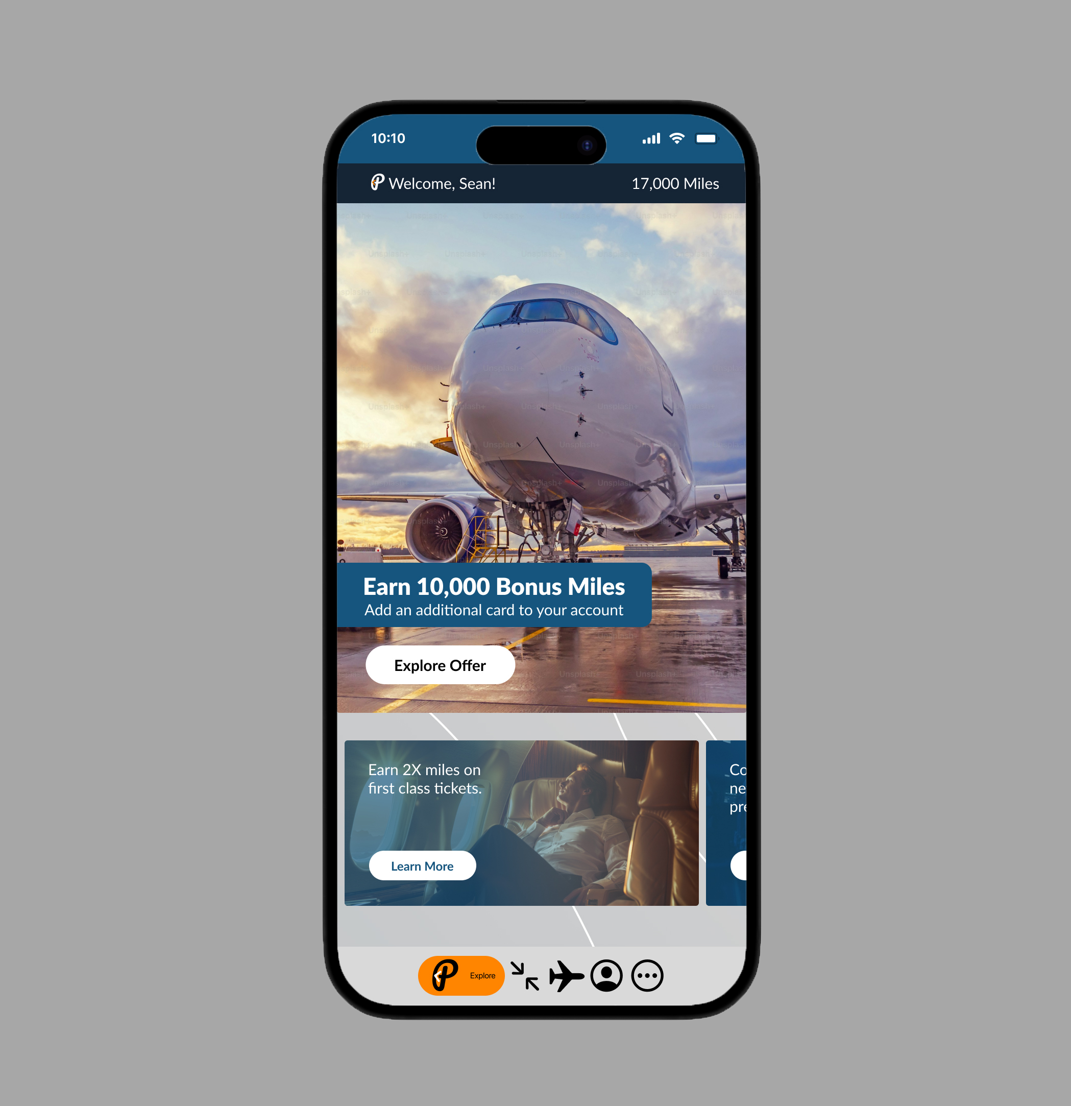
- Simplified Search & Checkout → Reduced steps from 7 to 4, making the flow faster.
- Transparent Pricing → Clear breakdown of fees before checkout.
- Visual Seat Map → Easy drag-and-select interface for choosing seats.
- Consistent Design System → Reusable components improved UI consistency.
- Accessibility Enhancements → Better contrast, larger touch targets, and clear hierarchy.
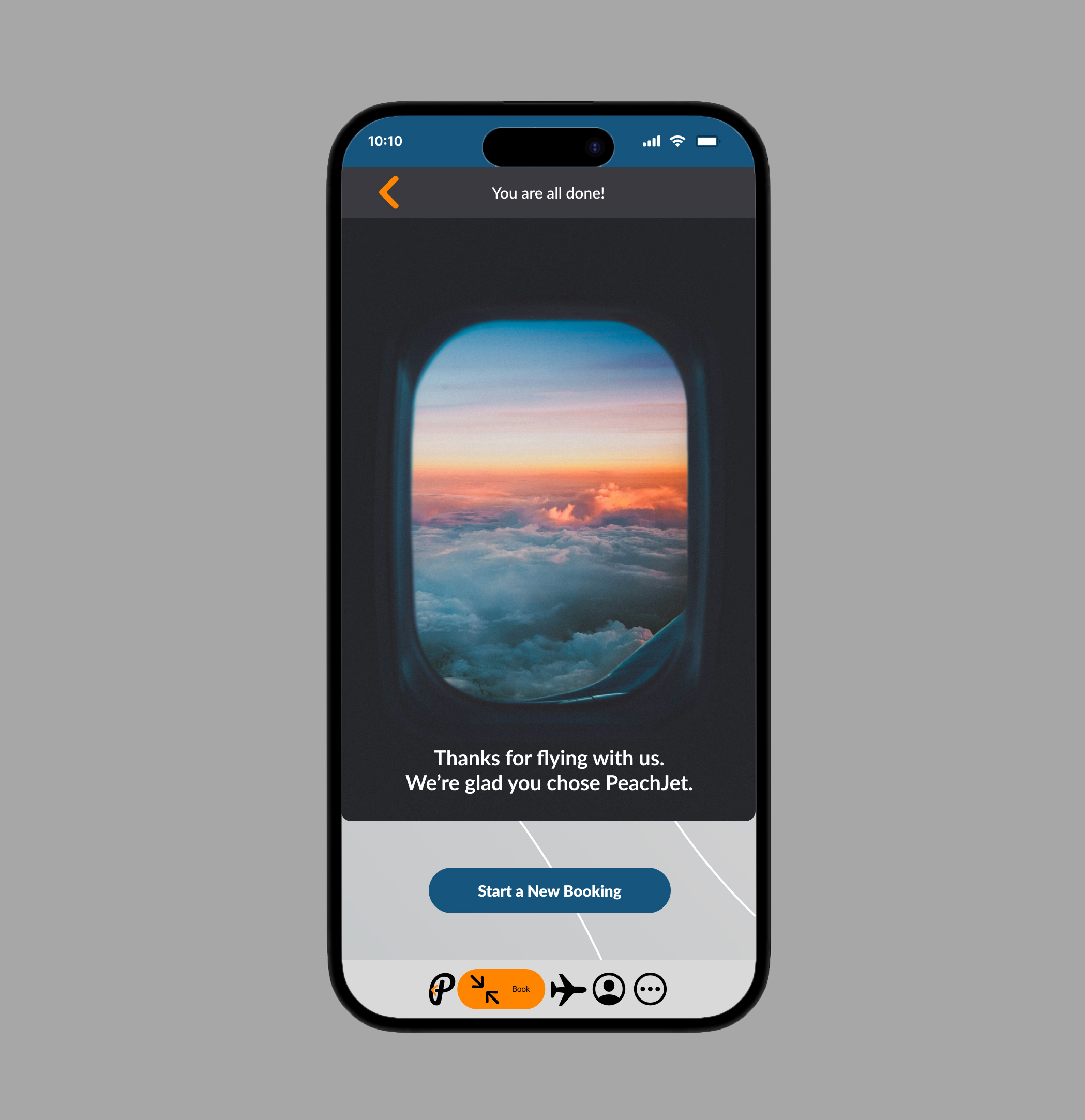
Outcome
The Peach Jet concept app offers a streamlined, transparent, and enjoyable booking process. By addressing gaps in existing airline apps, it demonstrates how thoughtful UX and clean design can transform a routine task into a smooth experience.